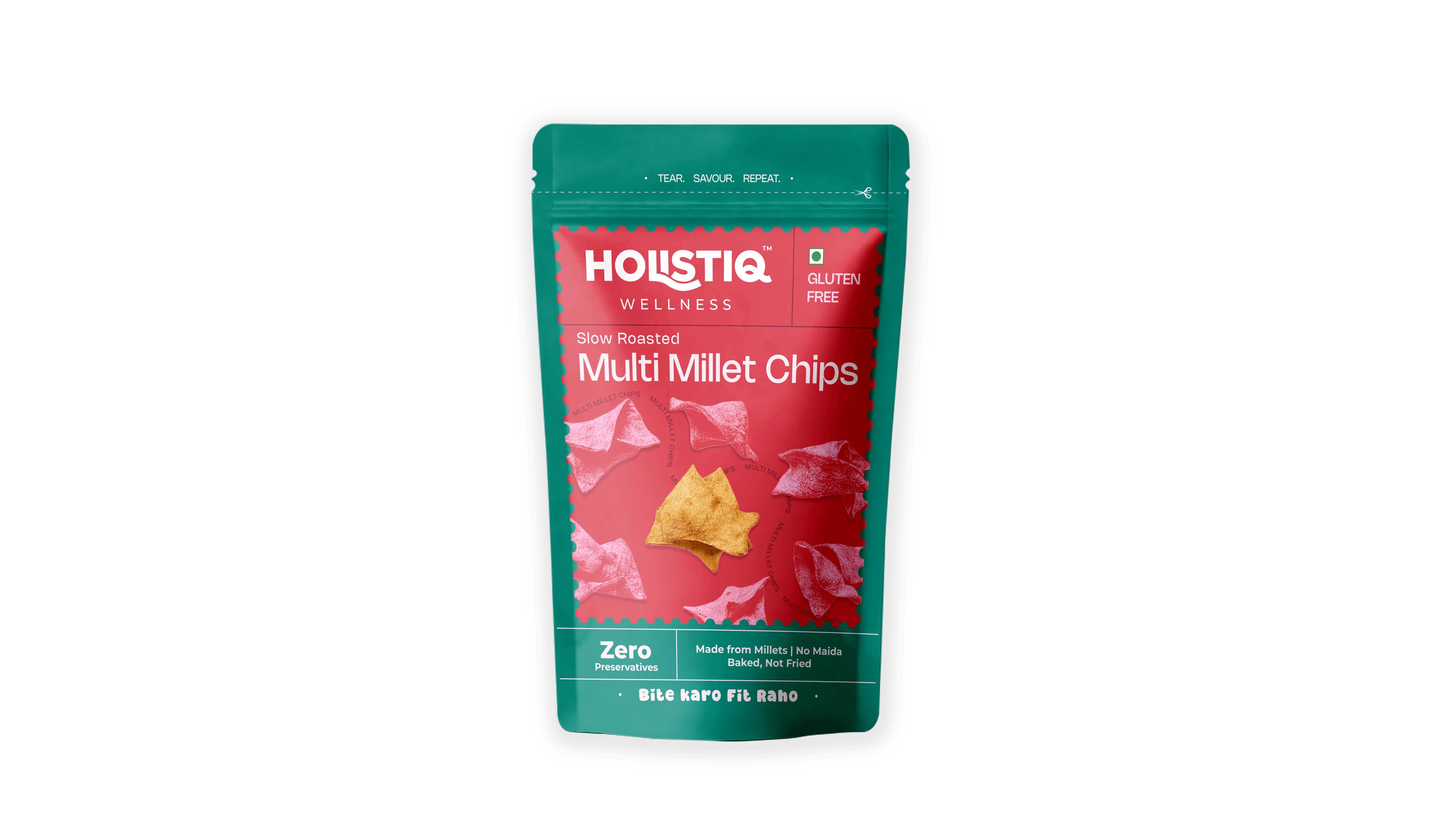
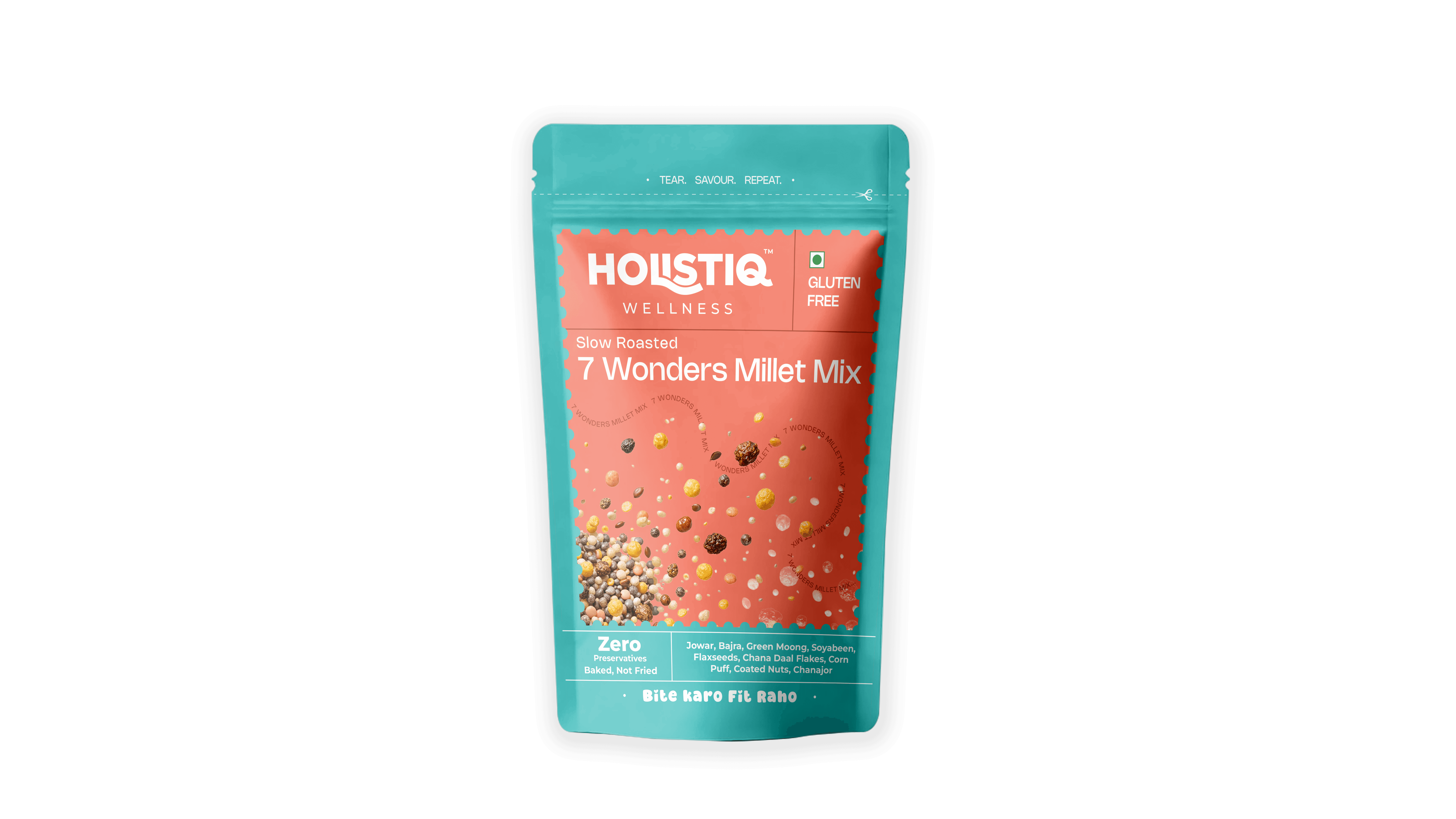
Holistiq
Snack Packaging
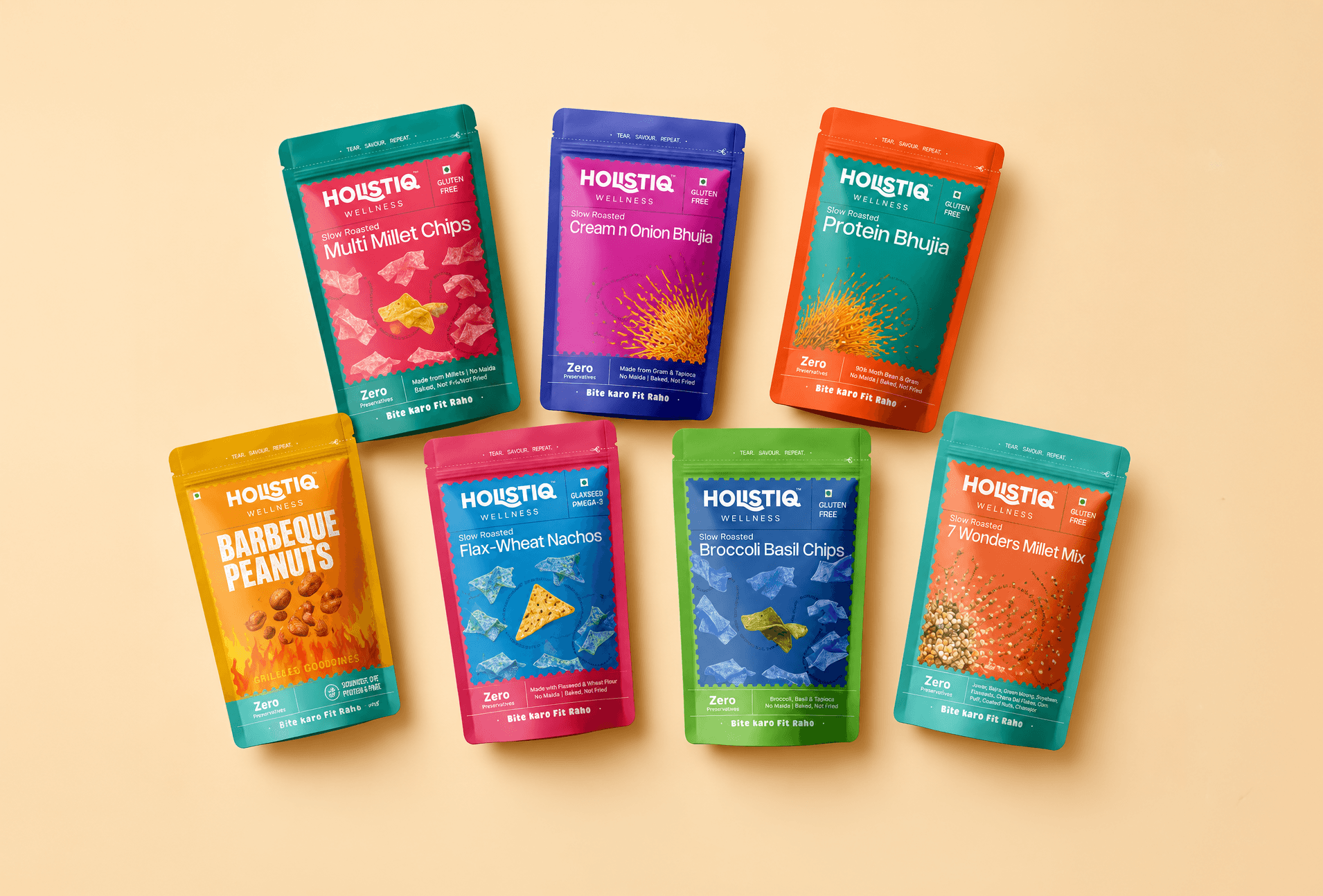
Holistiq Wellness is a Mumbai-based startup launched in 2024–25. Its tagline is “Bite Karo, Fit Raho”. The brand story emphasizes creating “a clean, conscious alternative rooted in India’s ancient food wisdom”. Key attributes on collaterals include “Gluten Free, 100% Plant Based, High Fiber, Antioxidant-Rich, Cholesterol Free” Holistiq promises that its snacks are “light, roasted, nutrient-rich and genuinely better for you”. This wellness positioning is consistent across content - e.g. Instagram slogans like “Wholesome • Clean • Guilt-Free Snacking” and “Eat Right, Feel Right.”. The founder appears to build on positioning Holistiq at the intersection of healthy eating and mindful self-care.
Concept
Typography
Vibrating Color Scheme
Final Packs
Design Brief
INTRODUCING NEW LINE OF PRODUCTS (REIMAGINING INDIAN SNACKS)
NUTS
(FLAVOURED CASHEWS & PEANUTS)
SNACKS
(BHUJIA, CHIPS MIXTURES)
The new product line is divided into two categories: snacks and nuts. Because these products feature traditional Indian snacks reimagined with modern flavors, the packaging needs to reflect this fusion. The design should be bold, vibrant, and celebrate the brand's Indian roots, while maintaining a clean, modern, and structured layout.
New Products Line
Stamp Inspired Visual Direction


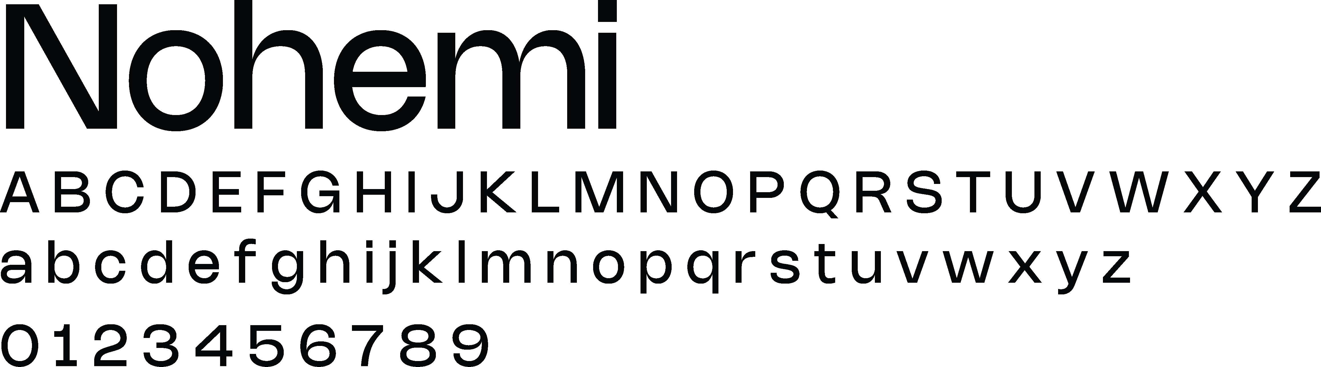

Used for headers and product names
Used for body text
Visuals



Different hues but same tonal value. This scheme creates a bold & conflicting palette which creates an illusion of a shadow and when placed in greyscale appear same


FoP & BoP